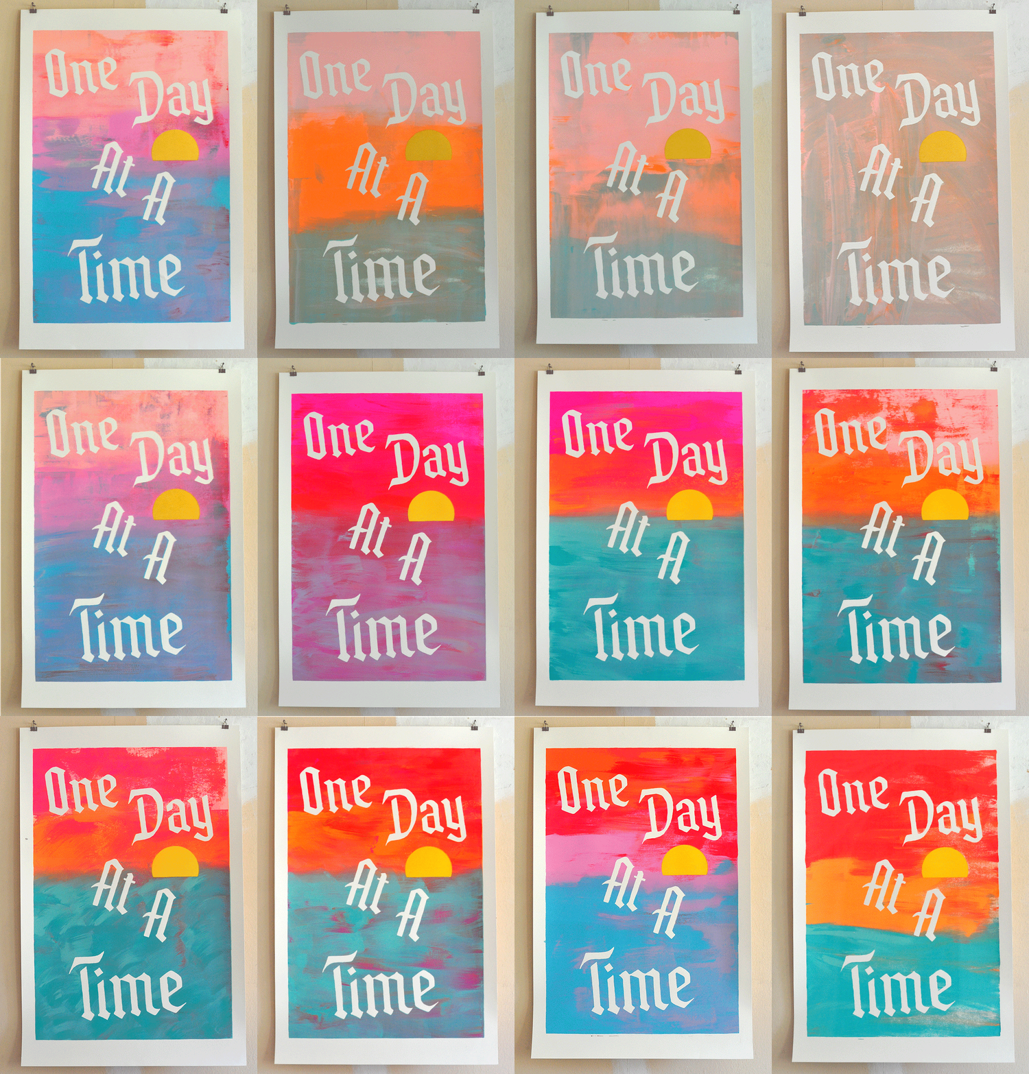
Hello! I’m back from my blog break — I made a lot of progress on the oversize print I wanted to work on last month, and I’m going to share that progress in this post.
In general I love making oversize screen prints on my favorite 26” x 40” paper, though the cost of this paper has (like many things) drastically increased since 2020, and its availability is inconsistent. As I mentioned in my blog break post, Ocelot Print Shop kindly let me borrow their 37” x 51” screen so I could make this print happen.
The short story behind this latest oversize print is that I wanted a giant, physical reminder to take things one day at a time — I recently completed Julia Cameron’s Artist’s Way program and the phrase was on my mind. I decided to make a large version of a postcard print I made a few years ago, which was inspired by the design of AA’s “One Day at a Time” bumper stickers of the 1980s. I remember seeing these bumper stickers on cars as a kid, and my family has experience with AA. I added a little sun to the design, inspired by Andy Warhol’s sunset prints. I think about these sunset prints a lot, and they are what I had in mind when I was deciding how I wanted to print these prints.
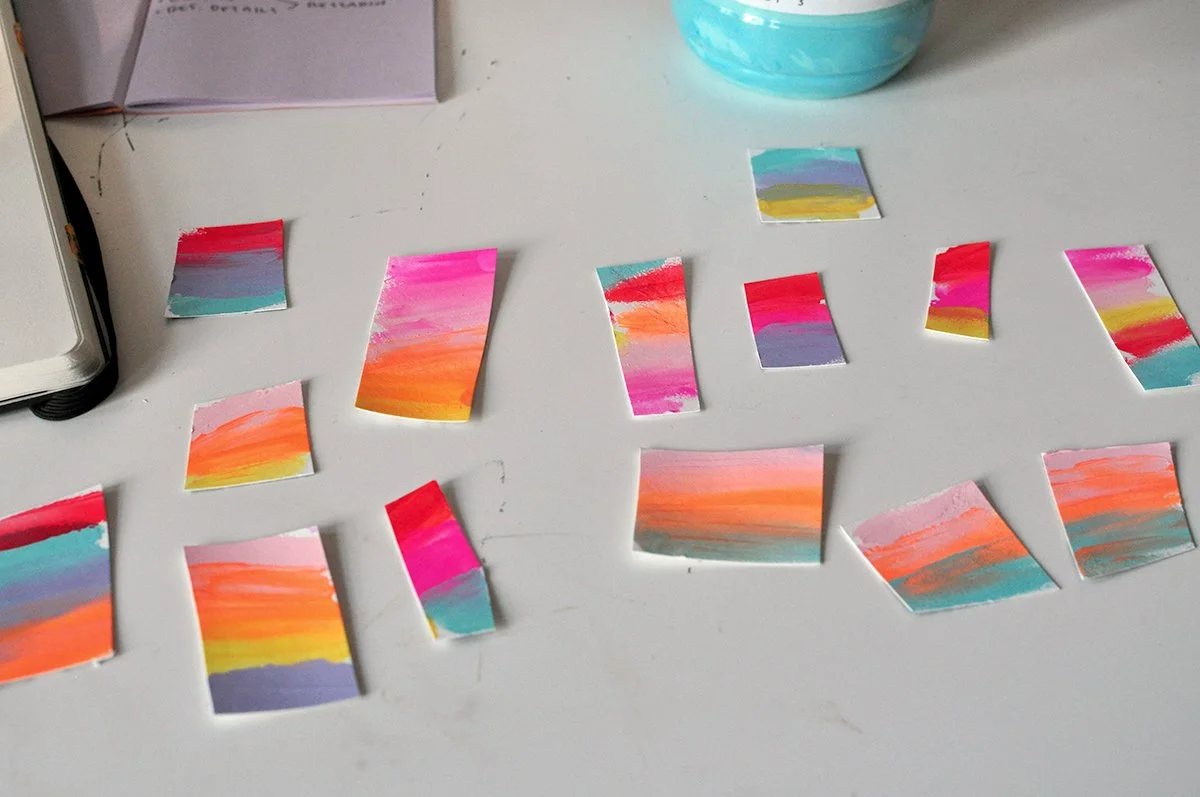
To figure out the colors, I smeared some options on paper to see what seemed right. I was trying to move out of my usual color palette — I think I was somewhat successful, though there’s a lot of my usual color friends in these tests.
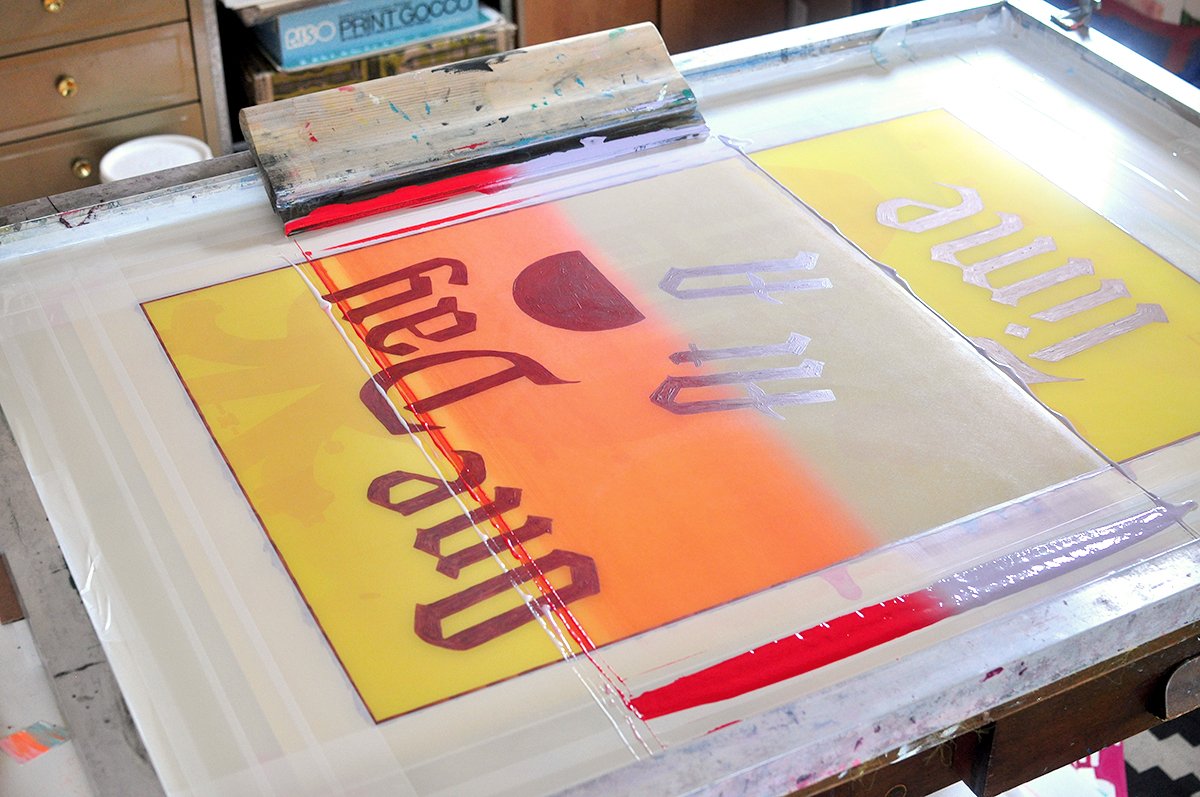
Printing large has some logistical issues, especially for an artist that works solo. My usual squeegee-pulling assistant (my nephew) went back to college in August, so I had to figure out how to work it alone. My initial idea was to run a bunch of split fountains across the print horizontally (like Andy’s sunsets), in pieces, and overlap them. I knew that was going to cause all kinds of problems, but I wanted to try it anyway.
Trying to print split fountains in pieces.
And it didn’t really work! I thought I could smoothly end the split fountains (I’m so sorry if you’re not a screen printer — this is going to be really boring) with a bit of transparent base at the ends of it, and hypothetically I think that could still work, but the problem with split fountains is that you have to run through so much paper before the inks are smoothly blending together. You can’t just run sheets and sheets and sheets of 26” x 40” paper waiting for the split fountain to smoothly blend. Or I can’t anyway — I don’t have the budget for that.
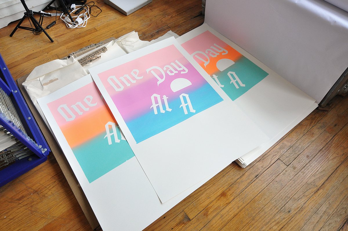
So anyway, here’s where I was when I was realizing it wasn’t really working:
I didn’t like how harsh the separations of the different colors in the split fountains were, but it would have taken so much more paper to keep printing to get them to start more smoothly blending. The separate split fountains were also not meeting up well — they’d inevitably overlap and there would be a harsh line at the overlap.
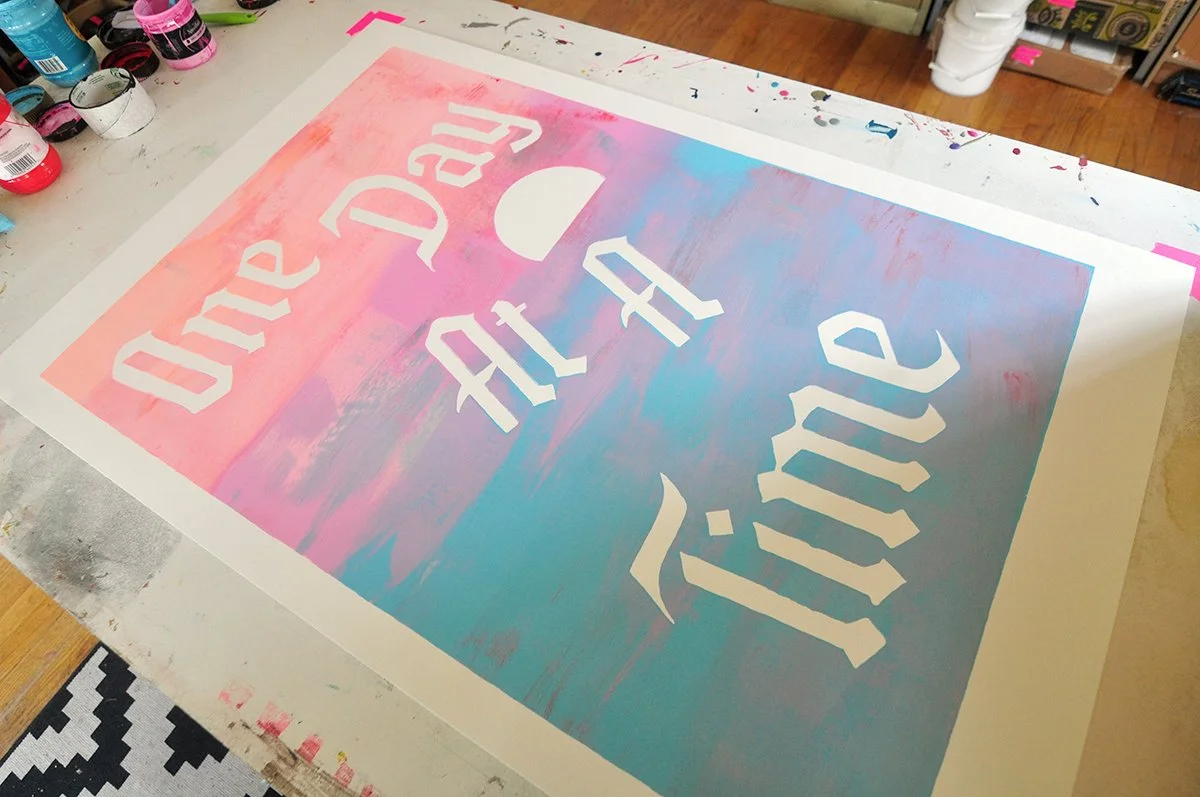
I didn’t want to lose all the prints (and paper) I’d already made, so I decided to try the “painting in the screen” technique I’ve been messing around with lately. Using my house painting brushes, instead of flooding the screen, I painted the ink into the screen, and I printed over the the sheets I’d already been working with for the split fountains, making each one of a kind. Below is a before and after:
I shot a short video of the painting process:
Here’s where the prints were at after the first layer (the background), wsg me for scale:
And here’s where they are now, after the suns have been printed (layer two):
I am contemplating whether I want to add a color layer to the text. Right now I am leaning toward leaving them as-is, because I like how the text kind of falls back and is secondary to the textured, washy, painterly background, which feels more soothing when compared with text that is blaring out at you. All of which goes better with the message of the print. I’m going to hang a few of them up at home and live around them for a while to help make the final decision.


