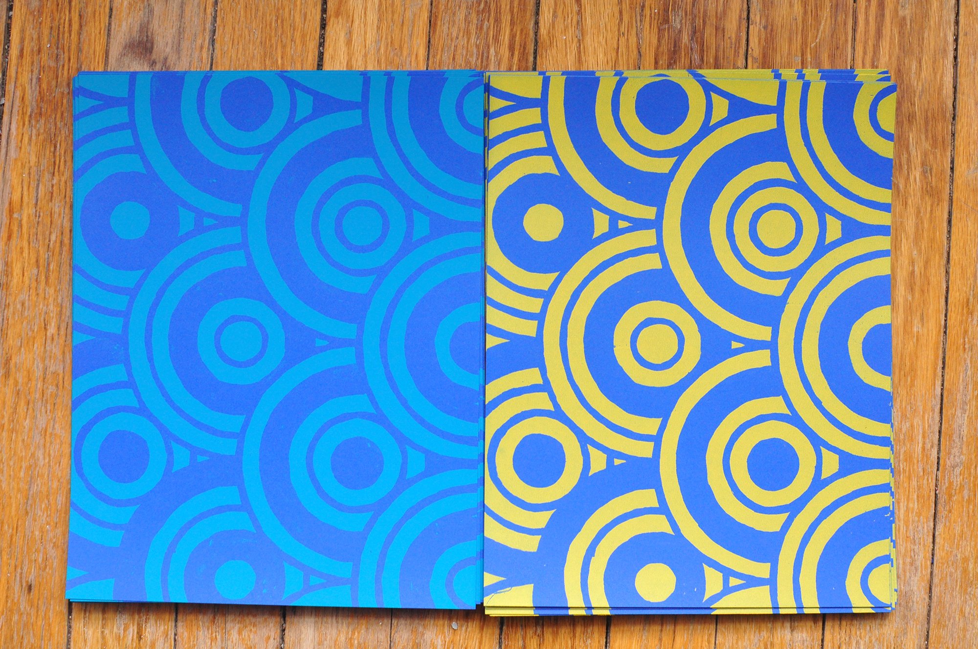
Last week I was screen printing some sheets we’re going to print on top of in a few weeks at the DIA (EDITED: rescheduled for June 17 & 18!), and I thought about Josef Albers’ quote, “Color deceives continually,” from his 1963 book Interaction of Color. In the book, Albers pairs different colors to prove his point, but I can do that here for you with the sheets I was printing. The side-by-side sheets in the photos are the same color, but the ink printed on them makes them look totally different from each other (blue ink on the left, yellow ink on the right):
On blue paper
On red paper
On purple paper
In his book Albers also wrote, “In visual perception a color is almost never seen as it really is — as it physically is. This fact makes color the most relative medium in art.” I think about that a lot, especially because color is an important part (my favorite part?) of the art I make. Not only do we not see color “as it really is,” I think we all perceive colors differently and have different sensitivities and our own opinions about the colors we like and don’t like, which affects our interpretation of art.
This also makes me think about the polls Komar & Melamid used to create their Most Wanted series (I just finished reading Painting by Numbers, which goes in depth about the project), and how worldwide the polls reflected that (of those polled) the most favored color in the context of art was blue. That brings me to some questions — like what shade of blue? And why? Part of it I think is that those polled preferred landscape paintings of lakes and oceans, and with the sky, that’s a lot of blue. Maybe the people of the poll were thinking about what they’d want to stare at to take them out of their everyday lives, and/or remind them of nature or a favorite vacation. One thing I find interesting about this project is that while the poll results were somewhat unexciting/same-y worldwide, when given free rein to answer “if you could commission a painting of anything, what would it be,” the answers were very creative and diverse, perhaps making this project more a reflection of the deficiency of polls than anything else.
For myself in terms of color, it’s sort of instinctual. I’m not technical about it, definitely not to the degree Albers was. It’s more of a “what feels right” thing, what am I drawn to, what makes sense for whatever I’m working on. I recently came across a funny quote from Andy Warhol that sort of describes this:
When I have to think about it, I know the picture is wrong. And sizing is a form of thinking and coloring is too. My instinct about painting says, ‘If you don’t think about it, it’s right.’ As soon as you have to decide and choose, it’s wrong. And the more you decide about, the more wrong it gets. Some people, they paint abstract, so they sit there thinking about it because their thinking makes them feel they’re doing something. But my thinking never makes me feel I’m doing anything.
—Andy Warhol, The Philosophy of Andy Warhol (From A to B and Back Again)
I love that — “my thinking never makes me feel like I’m doing anything” — it cracks me up but is also relatable and true to me.


